Transition - 2014 Year in Review
Open Universities Australia, Open Training Institute, E3Learning, Education Solutions and Open2Study
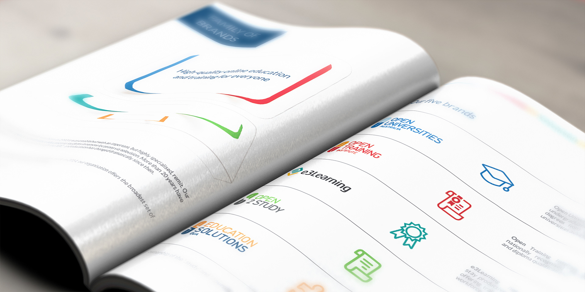
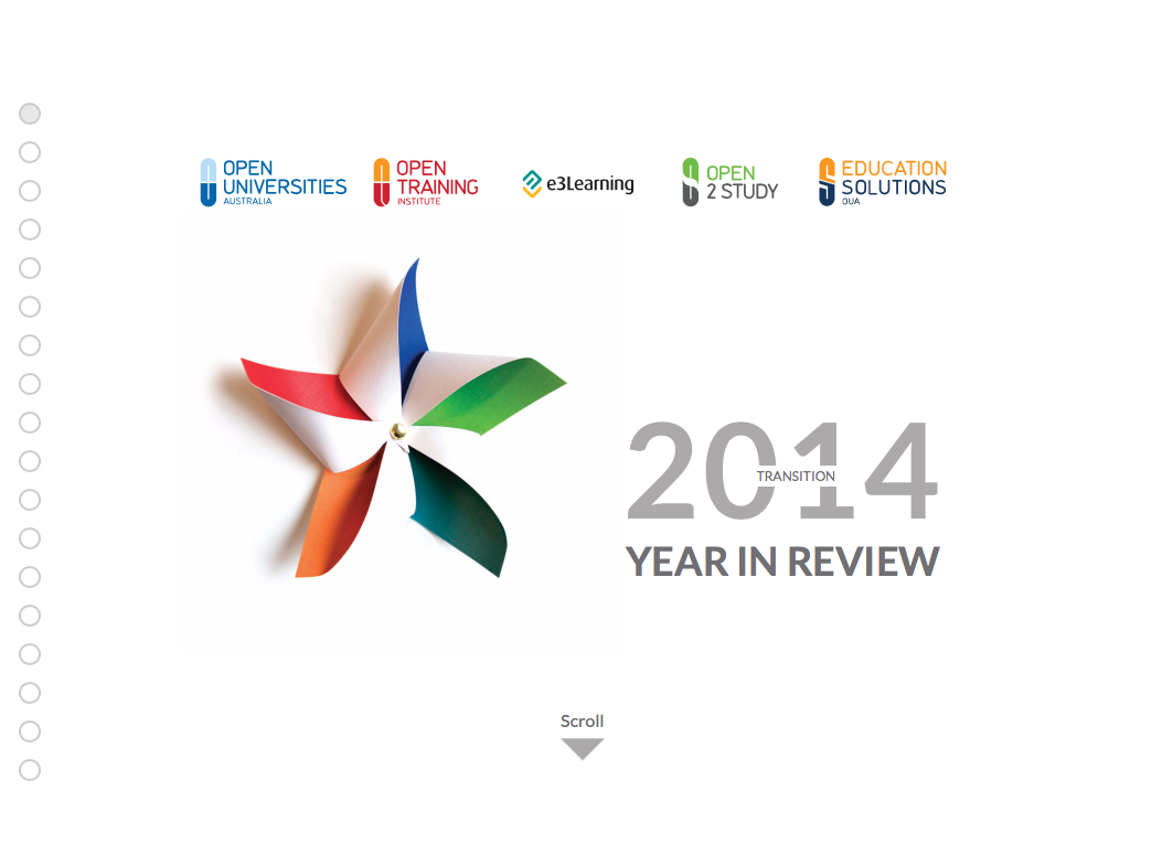
The theme for 2014 was 'transition' as Open Universities Australia grew into 5 different branches of online learning with each brand having it's own identity and colour palette. The challenge was to combine the five identities without them being too dominat and outshining each other.
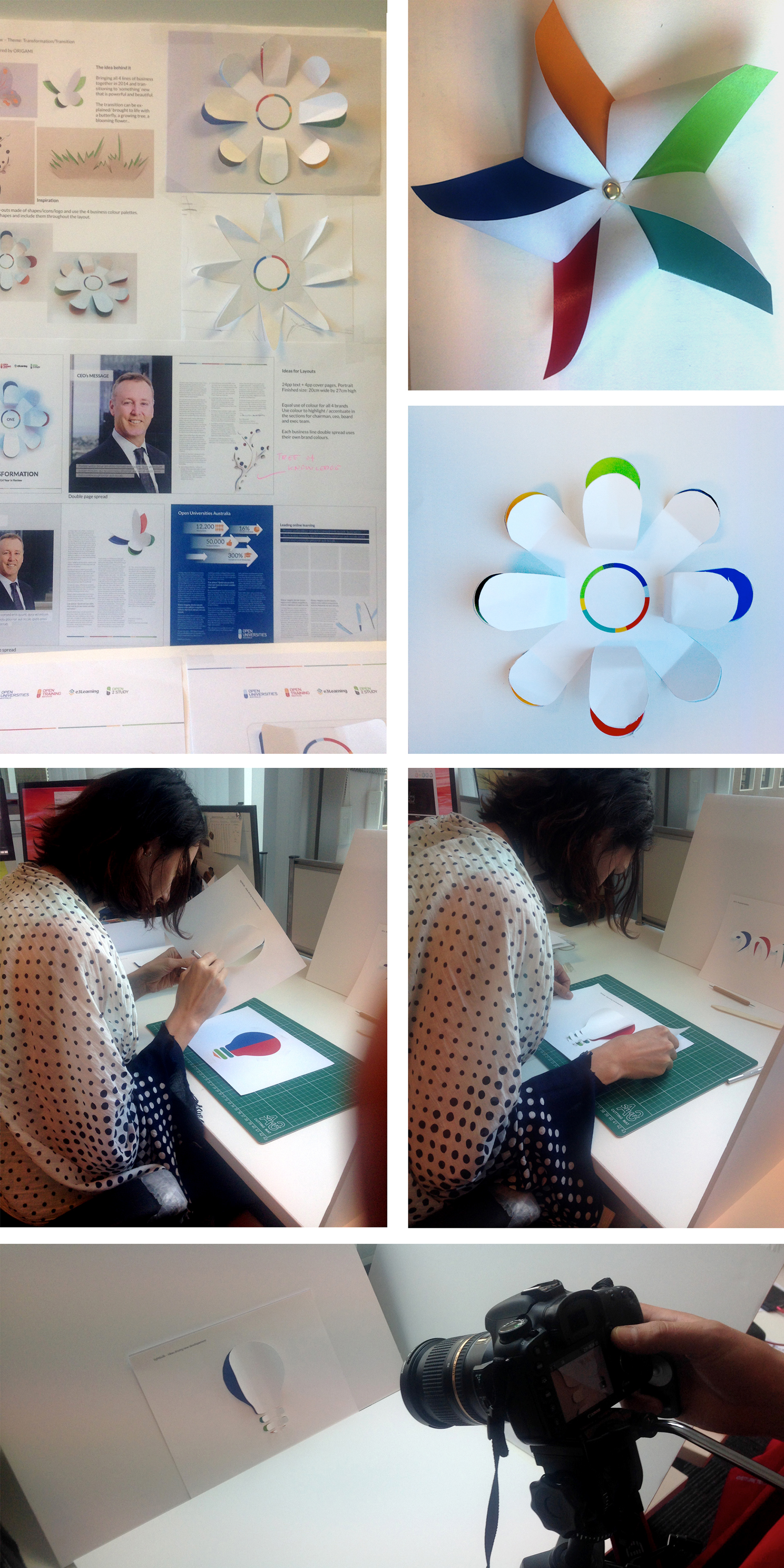
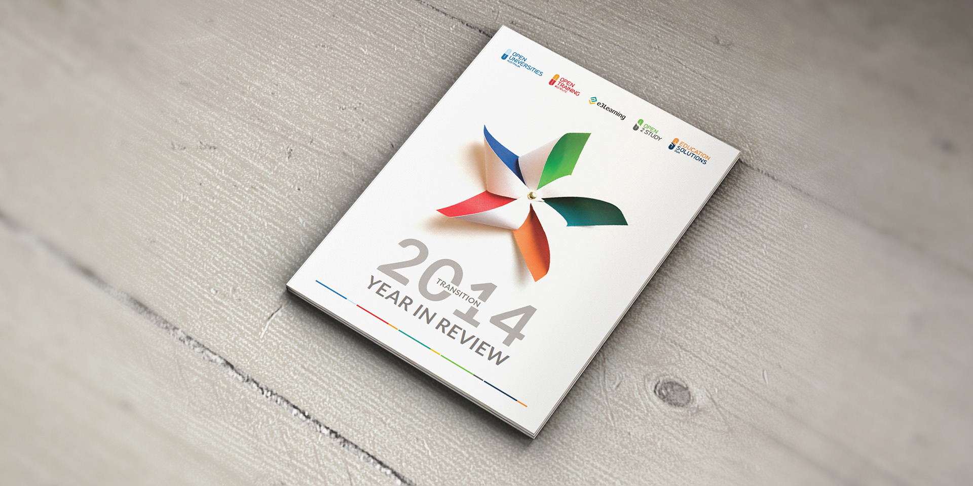
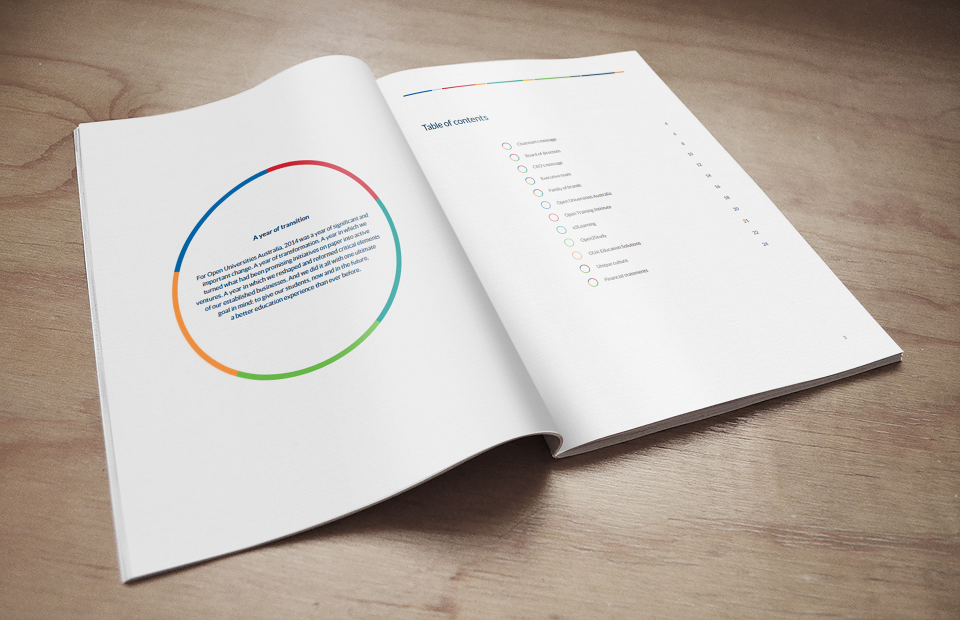
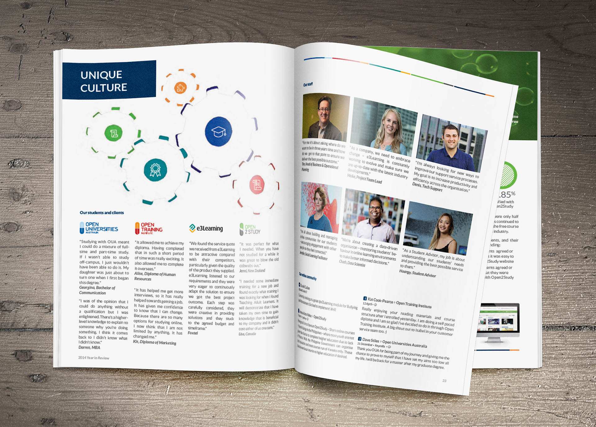
Inspired by the idea of a paper cut-out, I created symbols/shapes that revealed the dominant colour of each brand behind the cut-out. This creates the idea that all five brands are still growing into one big brand. The different shapes imply different values that are at the core of online education business, a pin wheel that spins with the wind of change with it creating new engery, a circle that brings all the brands together into ONE, a tree of knowledge that combines all areas of online study, a lap-top to re-inforce the element of online learning, a light-bulb that is inclusive of all ideas, cog wheels that interlock and work together in unisome. All shapes were hand-cut, photographed, layered with the brand colours and placed with a topic that suited them best. The same shapes were also used in the online version, turned into animation for the video clips and used as CSS sprites.
Inspired by the idea of a paper cut-out, I created symbols/shapes that revealed the dominant colour of each brand behind the cut-out. This creates the idea that all five brands are still growing into one big brand. The different shapes imply different values that are at the core of online education business, a pin wheel that spins with the wind of change with it creating new engery, a circle that brings all the brands together into ONE, a tree of knowledge that combines all areas of online study, a lap-top to re-inforce the element of online learning, a light-bulb that is inclusive of all ideas, cog wheels that interlock and work together in unisome. All shapes were hand-cut, photographed, layered with the brand colours and placed with a topic that suited them best. The same shapes were also used in the online version, turned into animation for the video clips and used as CSS sprites.
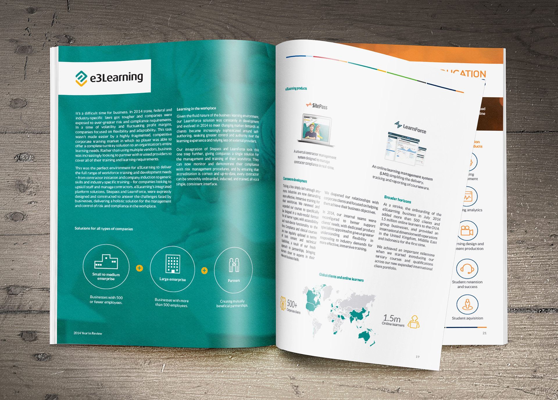
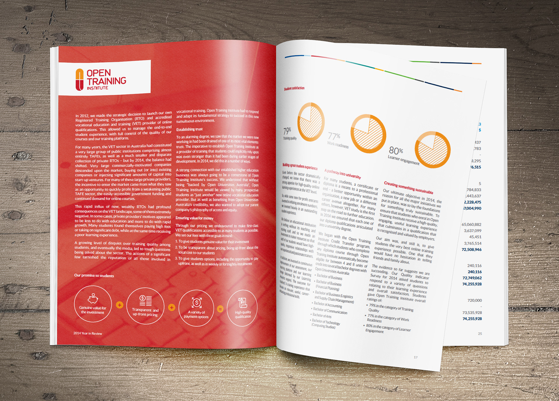
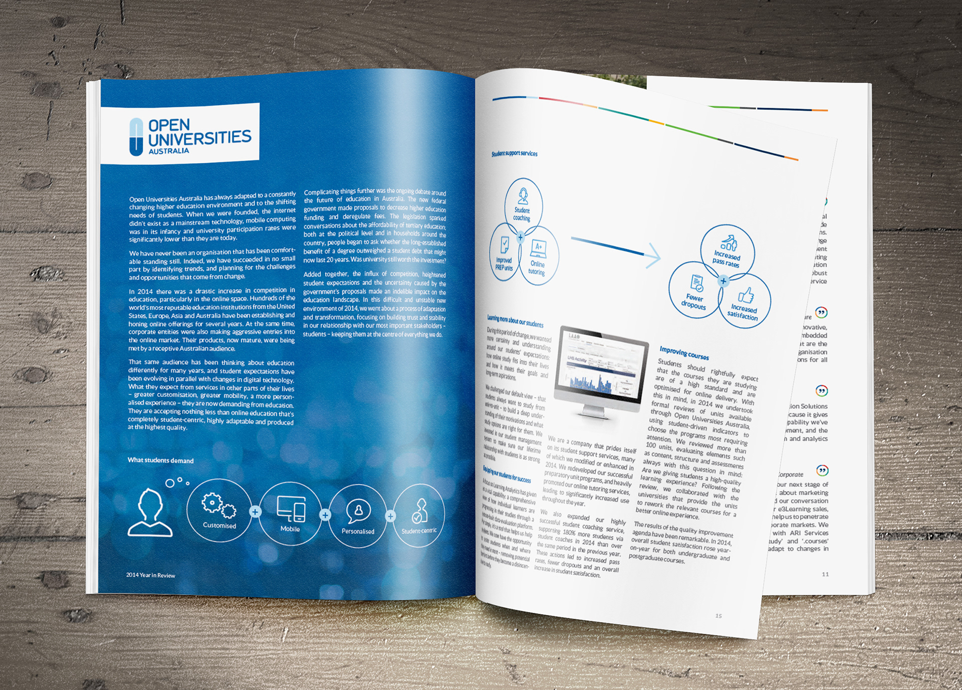
Each brand was given a double spread to express it's own uniqueness and how it fits into the circle. These pages are kept in their own brand colours.
After the annual report had gone to print I started work on the digital version of the annual report. I worked closely with the development team to bring the report to live with interactions and re-creating the look and feel of the printed report.
The online version can be viewed here: https://www.open.edu.au/media/yearinreview2014/index.html#welcome-page
The creative process