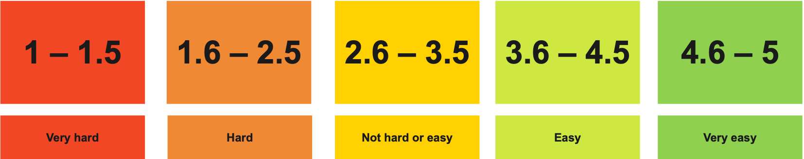
A Likert scale question is included after every tested feature to better understand how much effort it took to use the current features on the VicTraffic website. In our case we used a five-point scale of numbers to align with relevant phrases like “very hard” or “very easy.” The question would be along these lines: 'How hard or easy was it for you to complete this task / find the information / understand the presentation ... ' Lower numbers are associated with very hard/high effort, and higher numbers are associated with very easy/less effort.
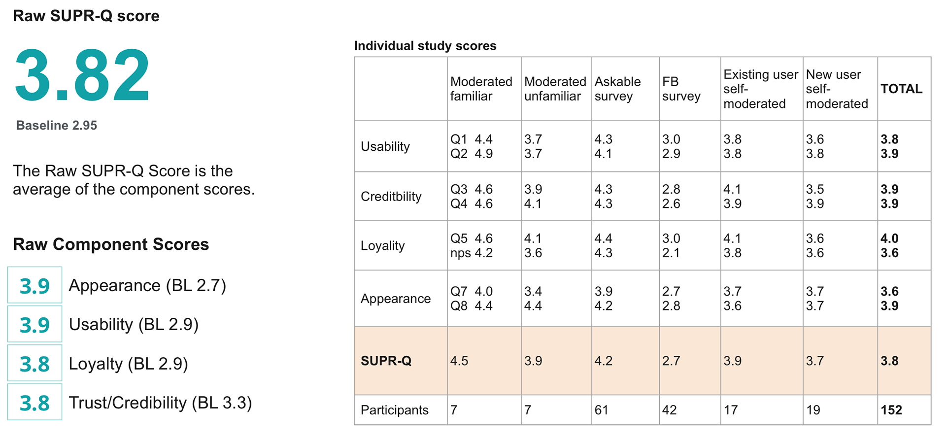
This is an example of how I used the raw SUPR-Q score for the ongoing VicTraffic benchmark study and this case shows how the user experience has improved over the baseline. The overall score was calculated by combining the results from all individual studies that made up the complete benchmark study which includes results from 152 participants.
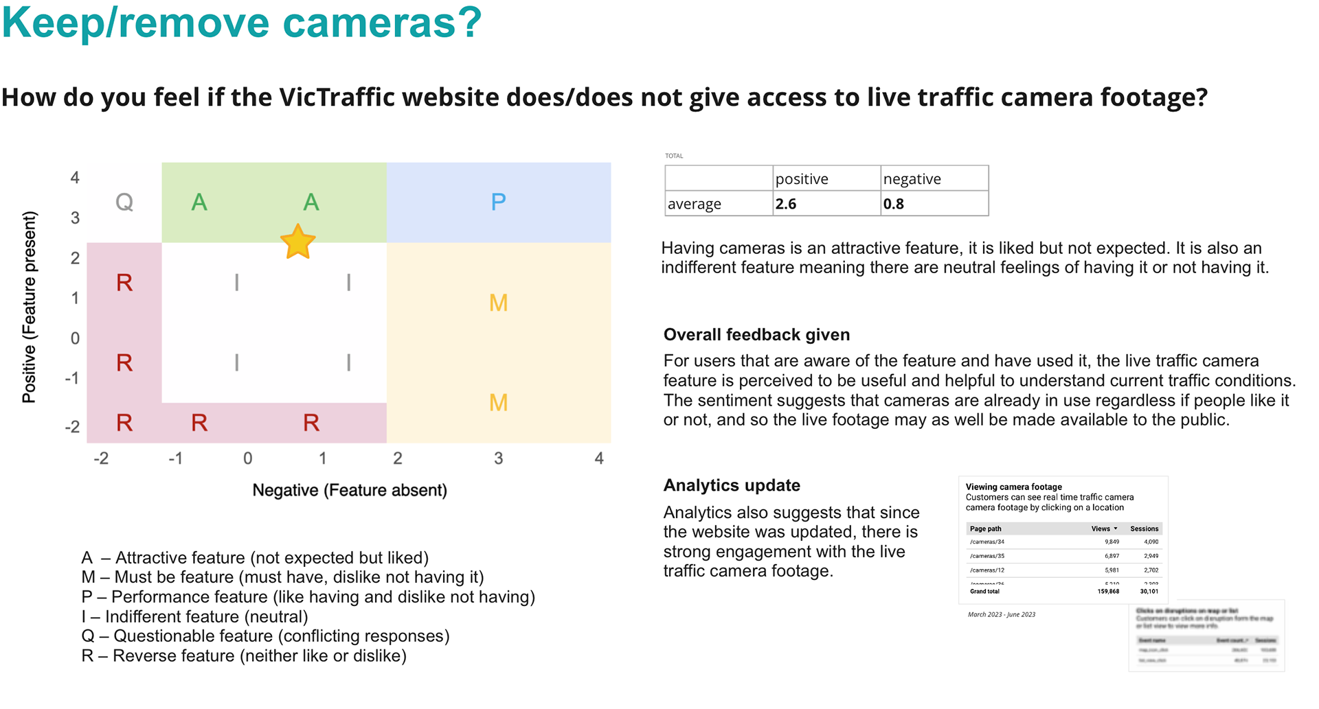
This is an example of how I used the Kano Model to determine how VicTraffic users feel if the traffic camera feature would be removed from the website. In the first release of the VicTraffic UI uplift, we made it very easy for customers to access traffic camera footage and analytics told us that there is now a higher uptake of the feature, the business though is considering to take that feature off the website and this metric shows that the feature is highly attractive.